Rodolphe Bresdin: entering the impossible forest
Two woodland prints reward a slower gaze. Explore Bresdin’s branches, tangled lines and luminous openings, then find your own way into the forest.
More than a view of trees
Stand back and Bresdin’s forest gathers into dark masses. Move closer and those masses break apart into branches, leaves, scratches and tiny intervals of pale paper. The image seems to change its scale as you look. This is the invitation of these woodland prints: a landscape that can be read as a whole, then explored almost line by line. The forest is recognisable, but its density makes it feel like a place reached through imagination.
The Forest of Fontainebleau
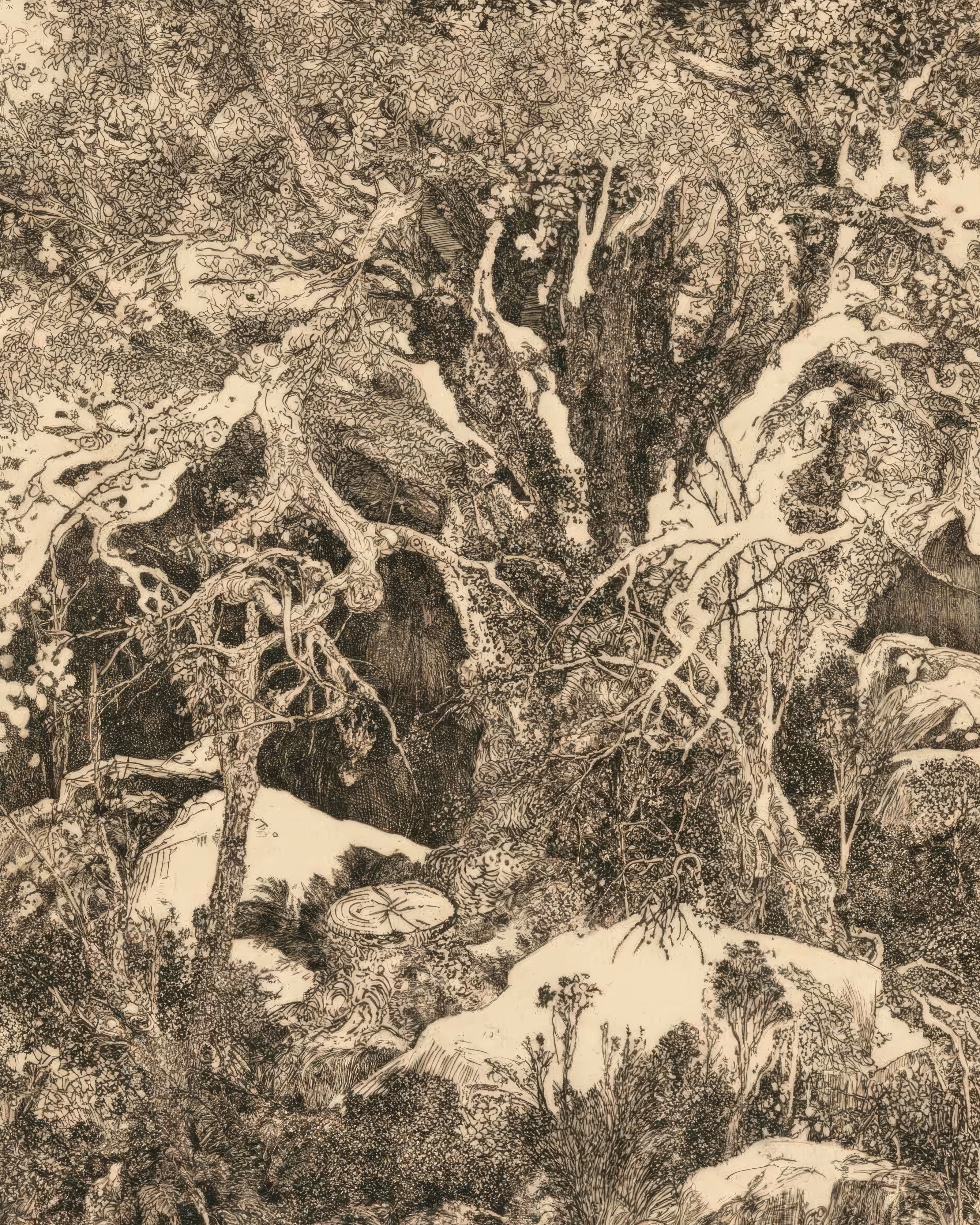
Fable catalogue edition after the historical work.
A great tree anchors the composition. Its branching structure spreads through the image, while rocks and patches of pale ground interrupt the busy texture. Fable’s catalogue identifies the historical work as an 1880 etching and drypoint by Rodolphe Bresdin, after the example held by the Art Institute of Chicago. The image shown here is the current Fable print edition. Notice how a few broad light passages keep the scene readable even when the linework becomes extraordinarily dense.
Clearing in the Forest
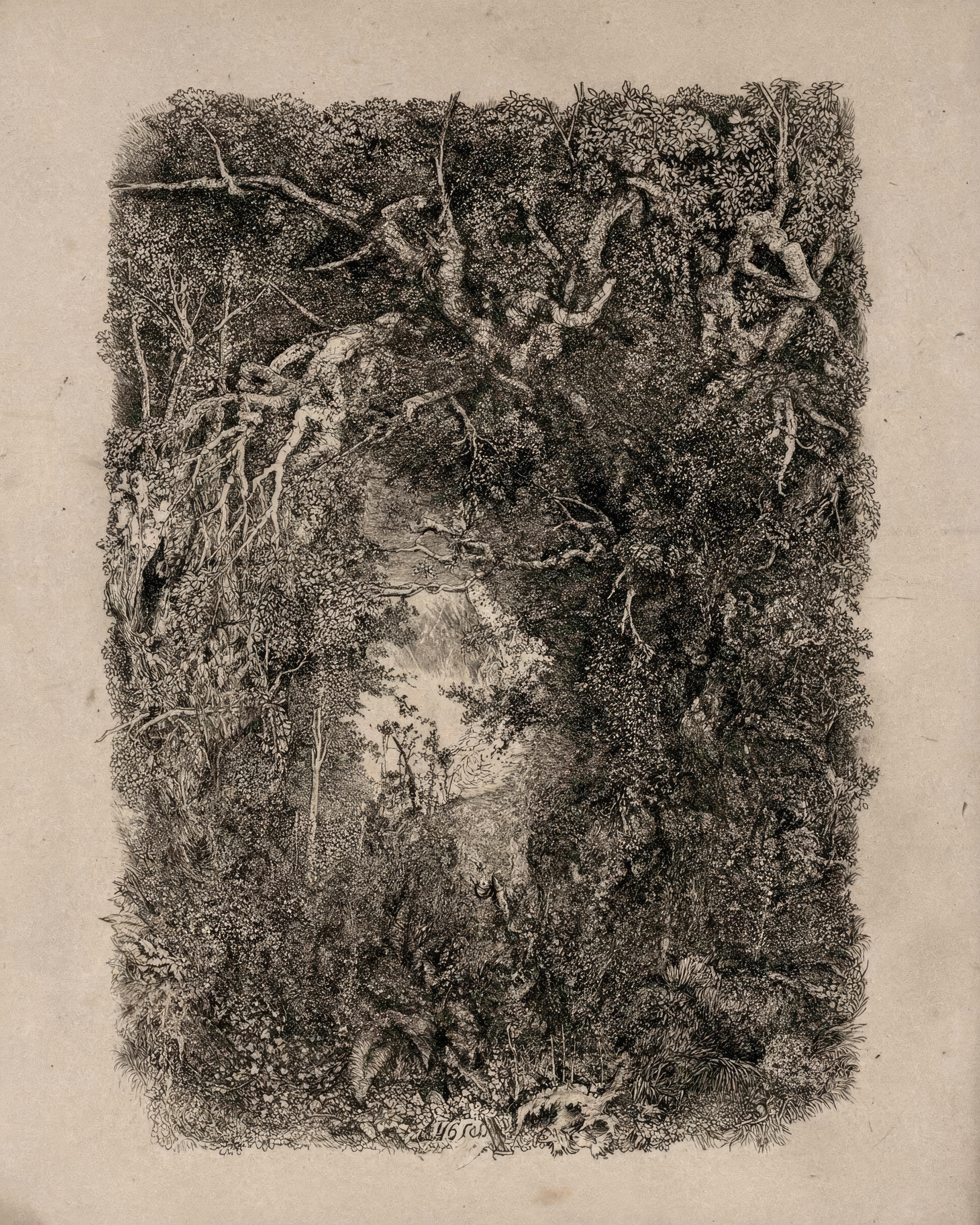
Fable catalogue edition after the historical work.
In this second composition, an opening seems to emerge from an almost continuous wall of vegetation. The pale central passage becomes more compelling because the surrounding branches offer so little space. The Art Institute’s collection record is the historical source recorded for this 1880 etching in Fable’s catalogue. Compare the two complete editions rather than isolated details: one gives the eye a commanding tree, the other a place to enter.
How to look at a dense print
Begin with the largest contrast. Where is the brightest area, and what dark form sits beside it? Next choose one line and follow it until it disappears into another. Finally, return to the whole picture. This simple change of scale is more rewarding than trying to identify every object at once. Black-and-white work is not visually empty: the spacing and thickness of marks can create as much variation as a palette of colours.
Give the forest space at home
A detailed print benefits from somewhere you can approach it, such as a reading corner or the wall beside a desk. Leave enough visual quiet around it for its intricacy to register. If the atmosphere is what attracts you, use Fable Artist to begin a new woodland composition from this reference. If the particular network of branches is the pleasure, choose the existing print. A new creation and a reproduction answer different wishes; the artwork page gives you a clear place to make that choice.