Interior colour schemes borrowed from the old masters
Boucher’s sky blue and blush, Tiepolo’s ceiling colours, van Dyck’s royal green and Ruisdael’s cloud grey: twelve old master paintings, each a colour palette for the home.
Long before paint charts, painters knew exactly which colours could live together. The old masters were also decorators: Boucher designed tapestries, Tiepolo painted palace ceilings, and their colour sense shaped the rooms of Europe.
Here are twelve old master paintings, each a colour palette for the home, in three groups: French pastels, Italian and Flemish jewel tones, and English and Dutch calm. Every one gives you a main colour, a supporting colour and an accent.
French pastels
Sky blue, blush and cream for elegant, airy rooms.
1. Cupids in Conspiracy
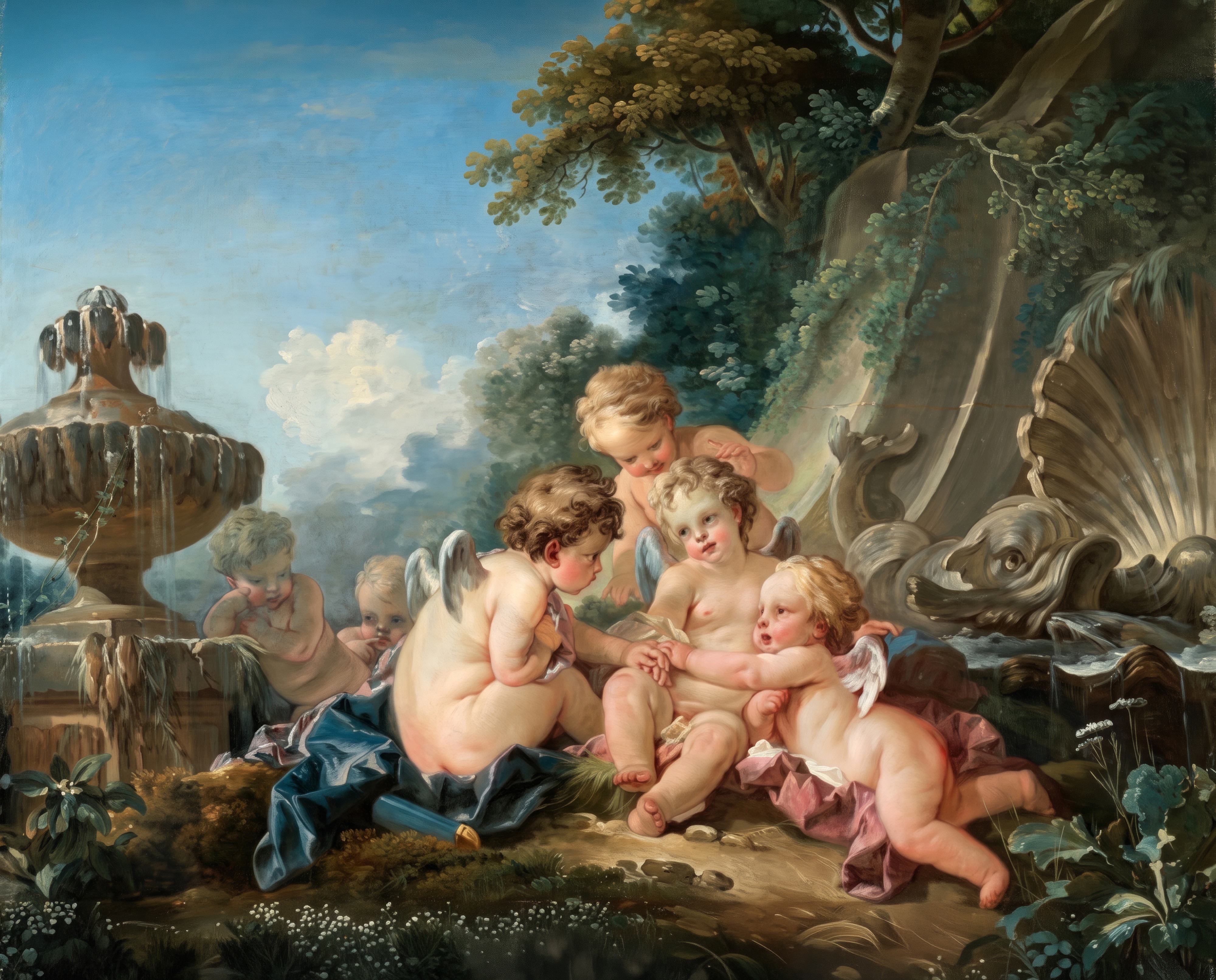
François Boucher, Cupids in Conspiracy, 1740s. Oil on canvas. Cleveland Museum of Art.
François Boucher, painter to Madame de Pompadour, painted these playful cupids in the 1740s.
Sky blue, blush and moss.
2. Declaration of Love
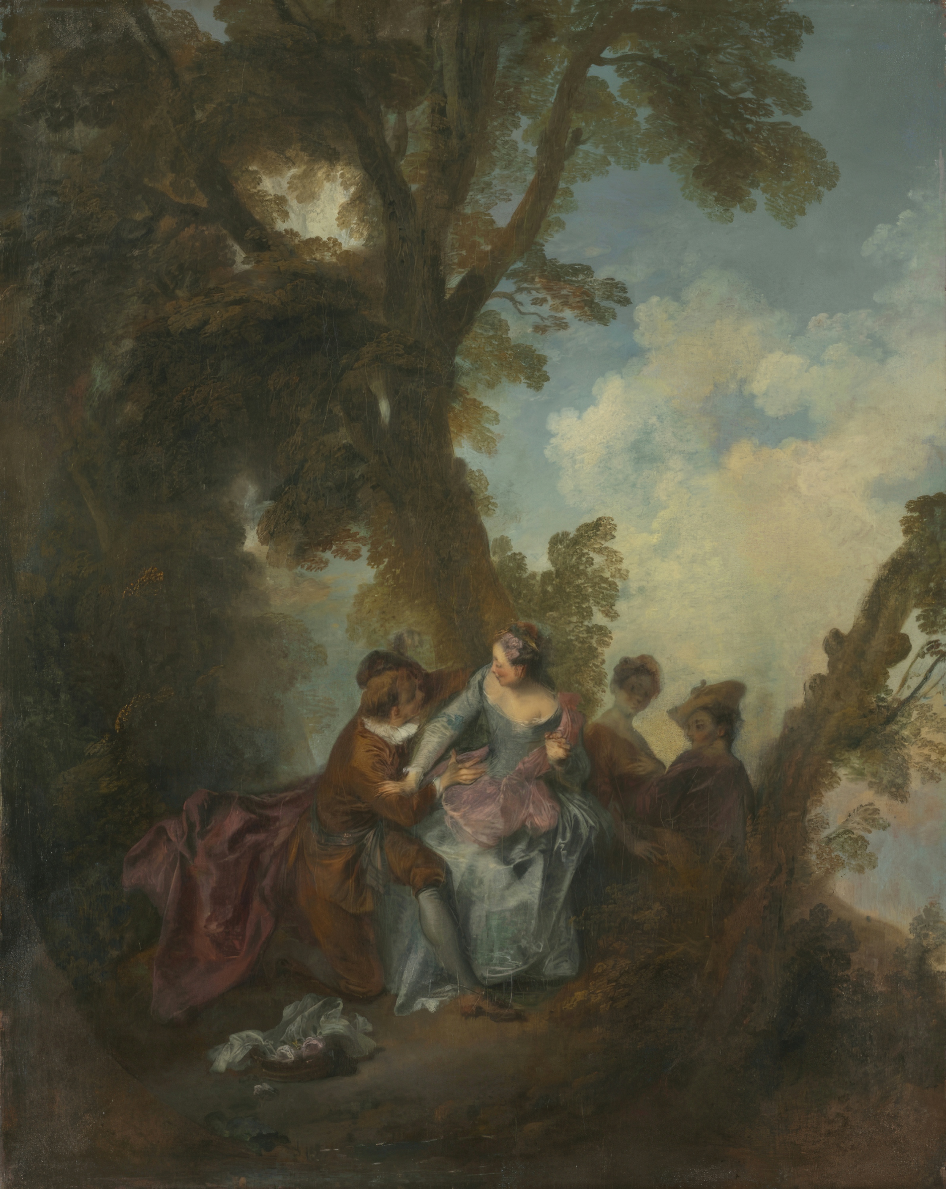
Nicolas Lancret, Declaration of Love, c. 1720. Oil on canvas. Cleveland Museum of Art.
Nicolas Lancret, a follower of Watteau, painted this garden scene around 1720.
Pale blue, cream and leaf green.
3. Portrait of a Woman
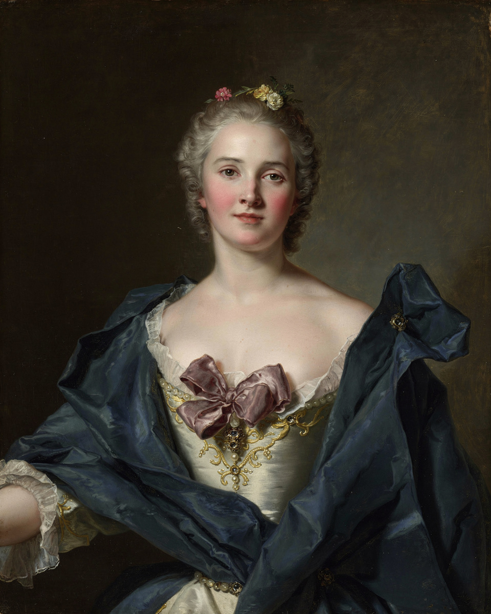
Jean-Marc Nattier, Portrait of a Woman, c. 1748. Oil on canvas. Cleveland Museum of Art.
Jean-Marc Nattier, the favourite portraitist of the French court, painted her around 1748.
Cerulean, blush and mauve.
4. Head of a Young Woman
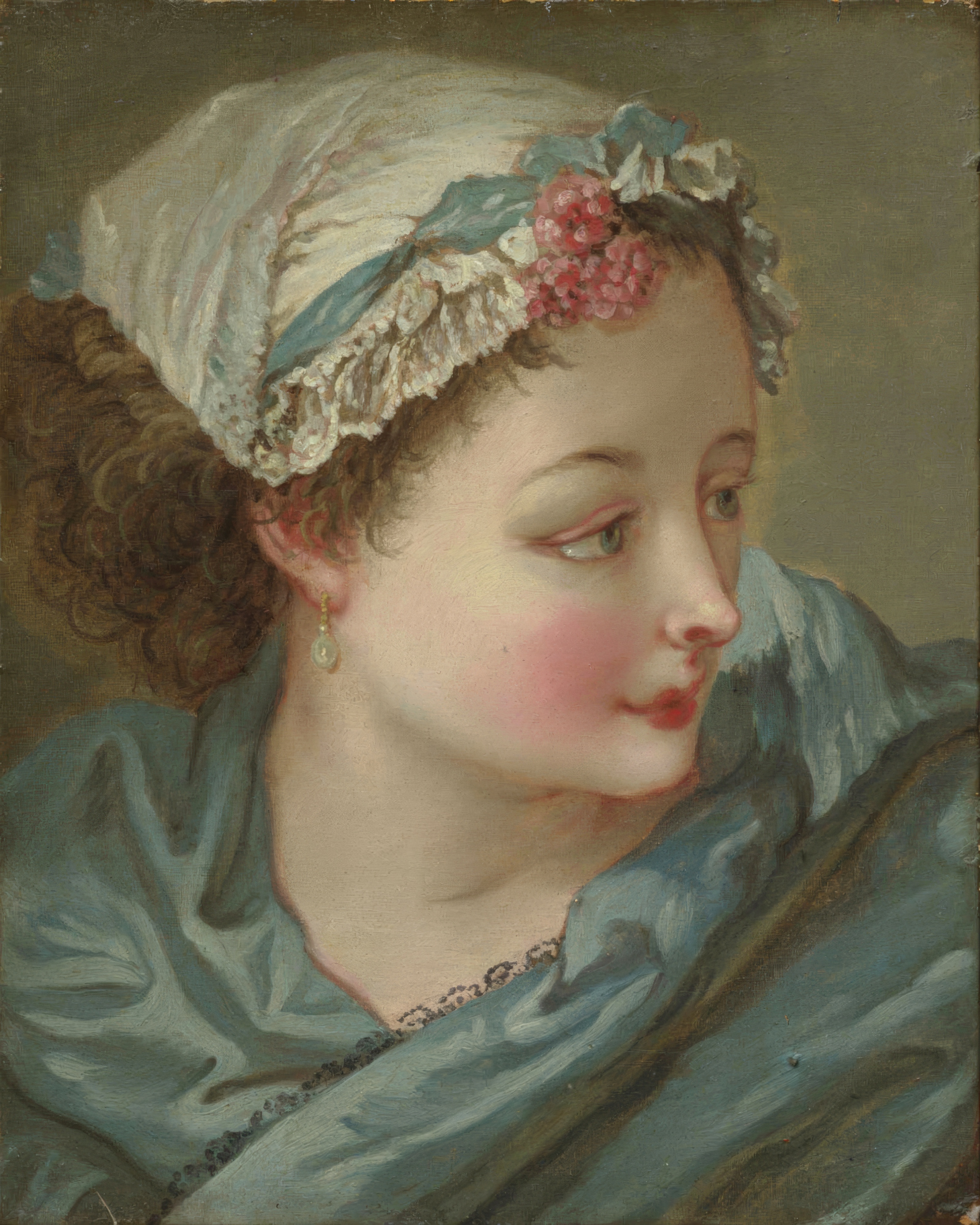
François Boucher, Head of a Young Woman, early 1730s. Oil on canvas. Cleveland Museum of Art.
François Boucher painted this study in the early 1730s, soon after returning from Italy.
Dusky blue, rose and cream.
Italian and Flemish jewel tones
Deep, confident colour for dining rooms and libraries.
5. Sketch for a Ceiling
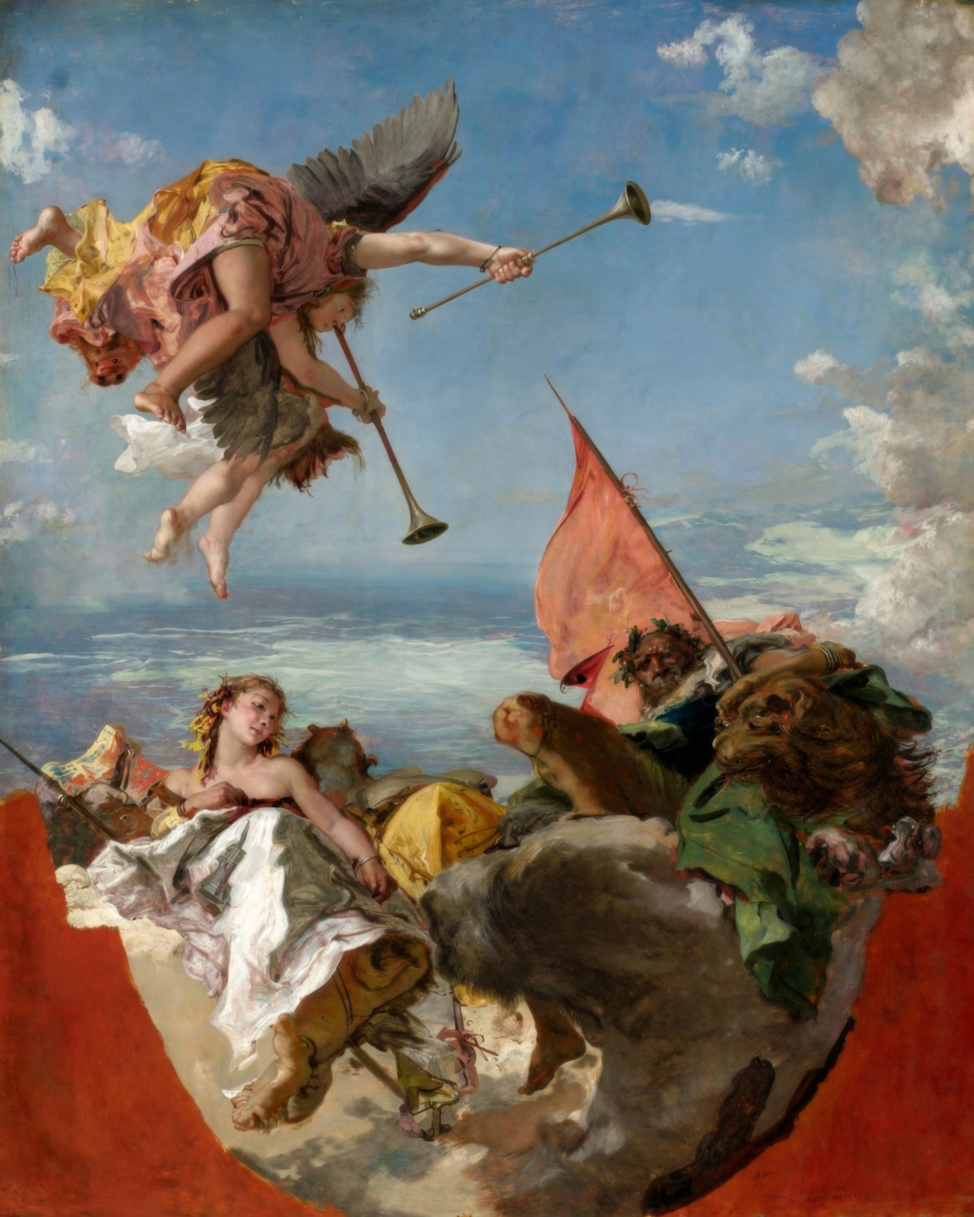
Giovanni Battista Tiepolo, Sketch for a Ceiling, 1750s. Oil on canvas. Cleveland Museum of Art.
Giovanni Battista Tiepolo painted this sketch in the 1750s to plan one of his great ceilings.
Azure, white, vermilion and gold.
6. The Meeting of Antony and Cleopatra
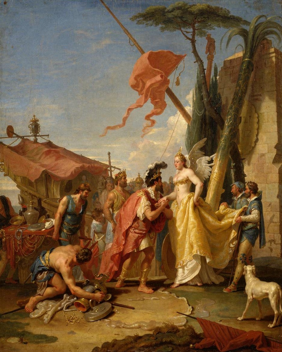
Giovanni Battista Tiepolo, The Meeting of Antony and Cleopatra, ca. 1745–47. Oil on canvas. The Metropolitan Museum of Art, New York.
Giovanni Battista Tiepolo painted this theatrical sketch around 1745–47, related to his frescoes in Venice’s Palazzo Labia.
Pale blue, gold and terracotta.
7. Diana and Cupid
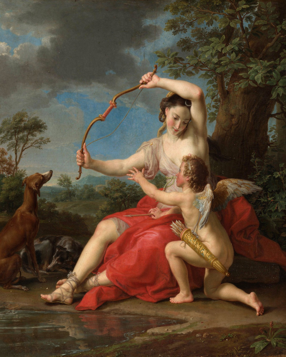
Pompeo Batoni, Diana and Cupid, 1761. Oil on canvas. The Metropolitan Museum of Art, New York.
Pompeo Batoni, the most fashionable painter in Rome, painted this in 1761.
Slate blue, crimson and forest green.
8. Portrait of Charles I (1600–1649)
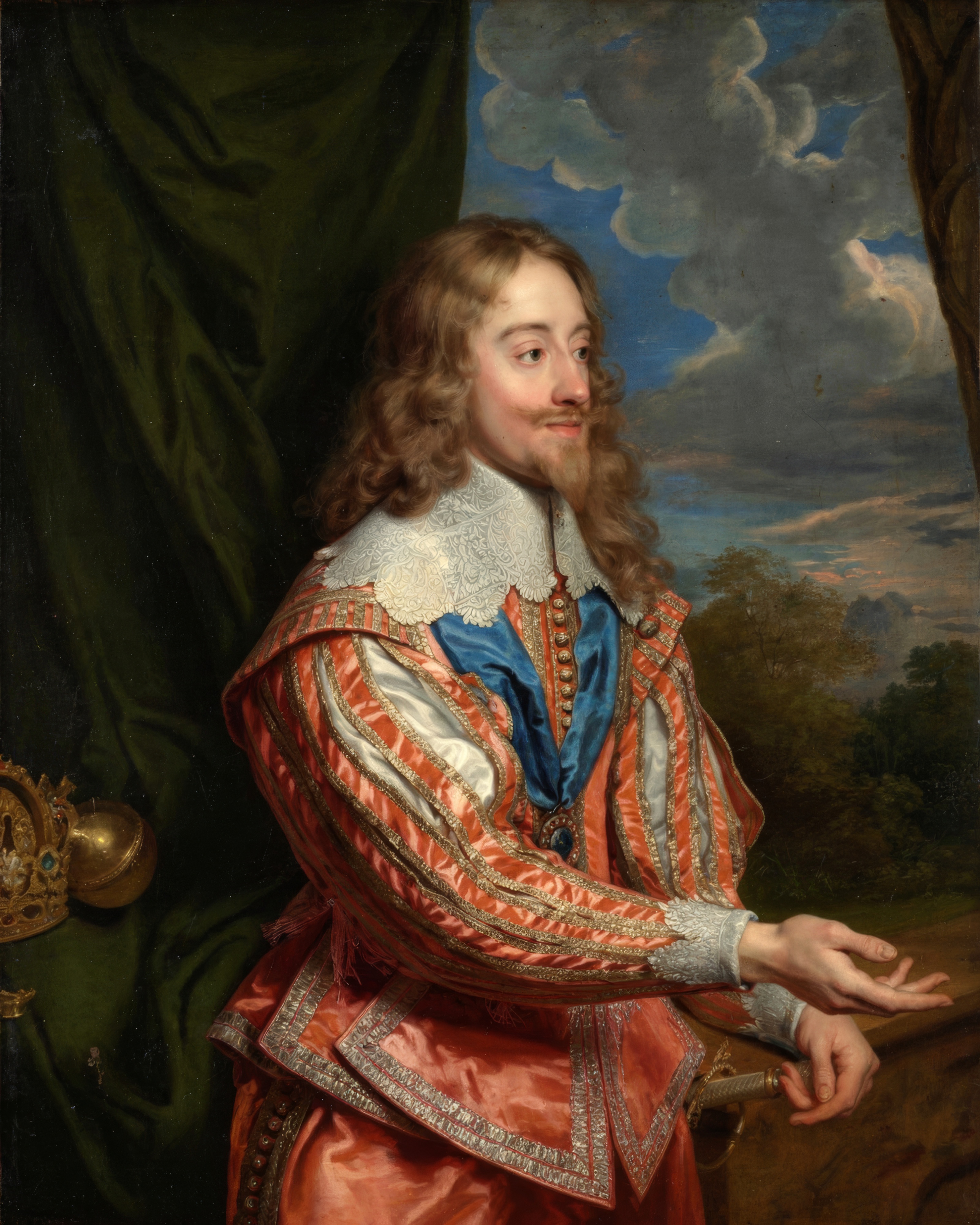
Anthony van Dyck, Portrait of Charles I (1600–1649), 17th century. Oil on canvas. Cleveland Museum of Art.
Charles I sat many times for Anthony van Dyck, his court painter, and this portrait follows van Dyck’s celebrated likeness.
Bottle green, garnet and steel blue.
English and Dutch calm
White, stone, sage and cloud grey for relaxed, timeless homes.
9. Portrait of Catherine Grey, Lady Manners
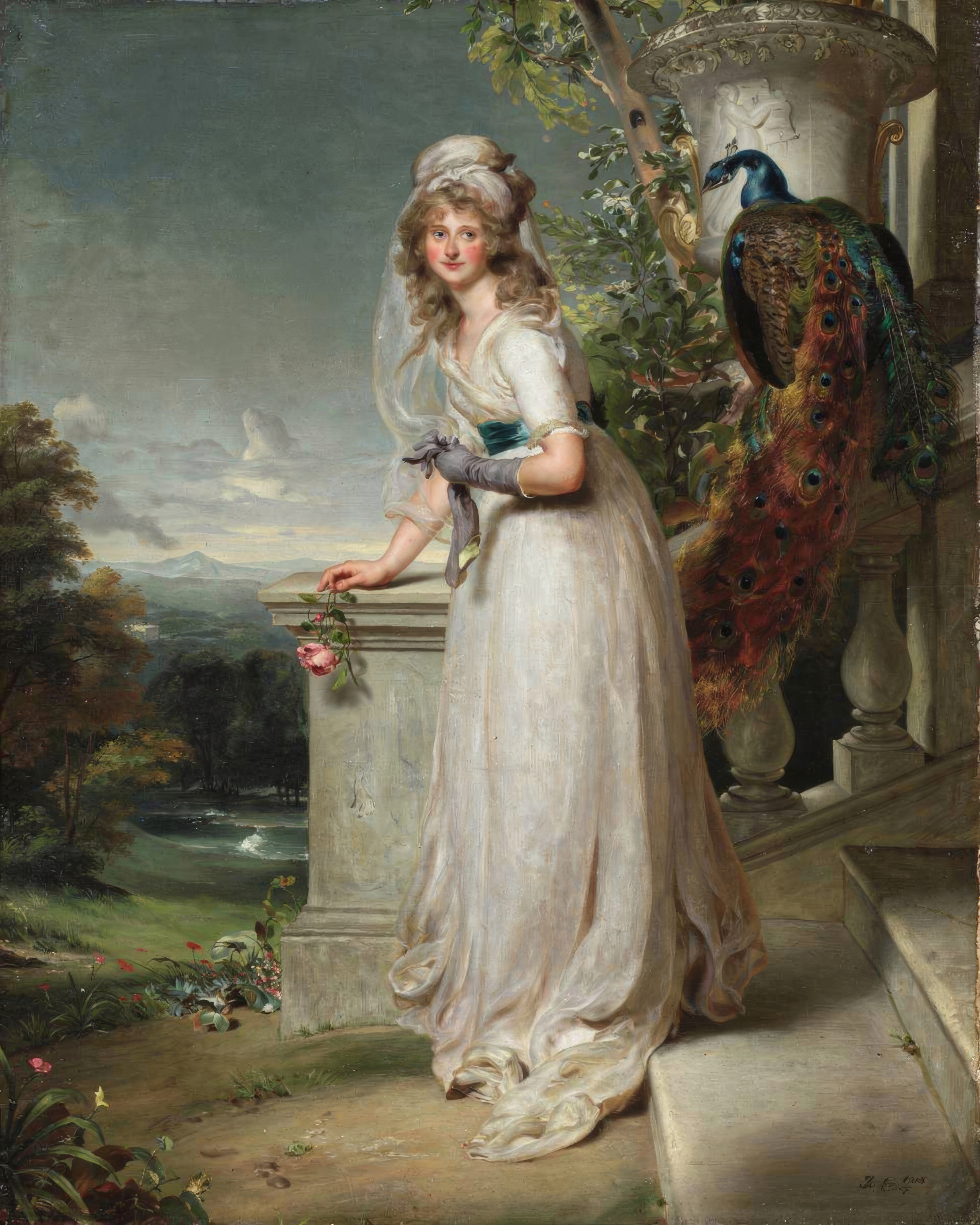
Thomas Lawrence, Portrait of Catherine Grey, Lady Manners, 1794. Oil on canvas. Cleveland Museum of Art.
Thomas Lawrence painted her in 1794, when he was just twenty five.
White, sage and cloud blue.
10. Mrs Francis Russell
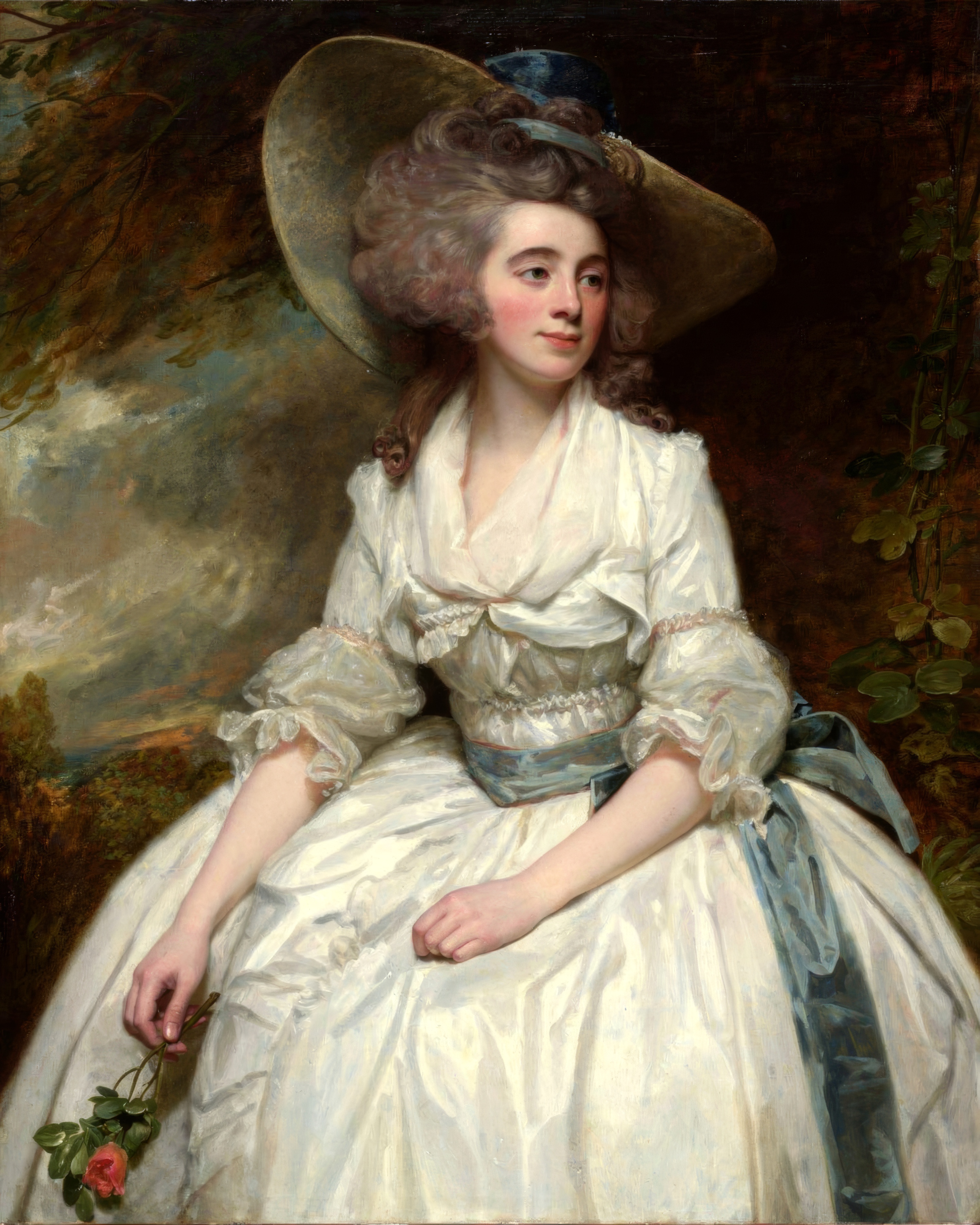
George Romney, Mrs. Francis Russell, 1785–87. Oil on canvas. Art Institute of Chicago.
George Romney painted Mrs Francis Russell around 1785–87.
Ivory, slate and stone.
11. Comtesse de la Châtre
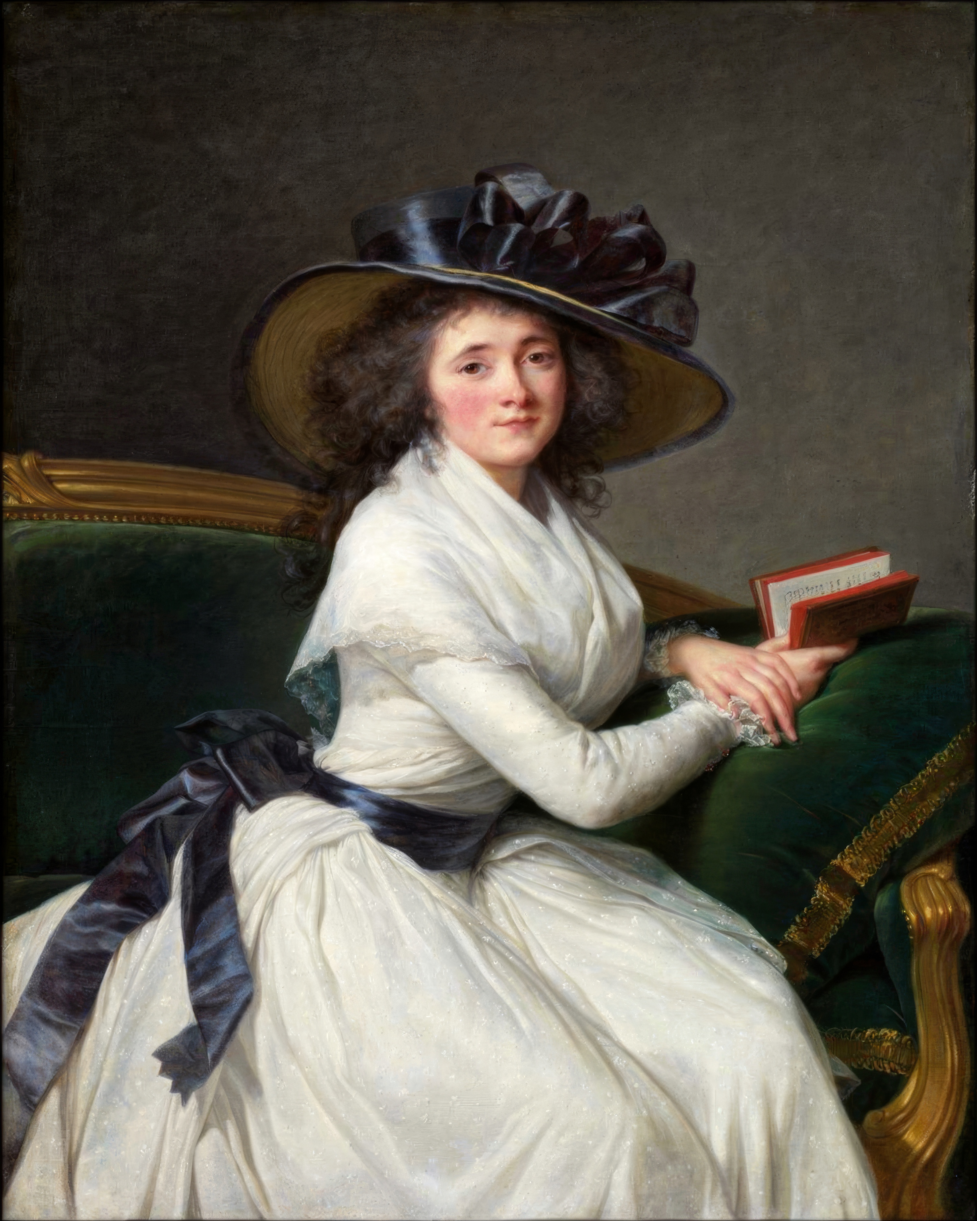
Élisabeth Vigée Le Brun, Comtesse de la Châtre, 1789. Oil on canvas. The Metropolitan Museum of Art, New York.
Élisabeth Vigée Le Brun painted her in 1789, the year the French Revolution began.
White, ink blue and bronze.
12. Kostverloren House on the Amstel
Jacob van Ruisdael, Kostverloren House on the Amstel, c. 1660. Oil on canvas. Amsterdam Museum.
Jacob van Ruisdael painted the old Kostverloren house near Amsterdam around 1660.
Cloud grey, deep green and brick.
Create your portrait in this style
Use a palette in the classic proportions: about 60 per cent main colour, 30 per cent supporting colour and 10 per cent accent. Then hang the painting itself as the key to the room. For more, see living room colour schemes, bedroom colour ideas and vintage wall art.
Questions
How do I choose a colour palette for my home?
Choose one painting you love and take three colours from it: a main colour, a supporting colour and a small accent.
What is the 60 30 10 rule?
A guide for balancing colour in a room: about 60 per cent main colour, 30 per cent supporting colour and 10 per cent accent.
Which old master colours suit modern homes?
French pastels like sky blue and blush, and English schemes of white, sage and stone, all feel fresh today.
Should every room in a house share one scheme?
Not exactly, but repeating one or two colours from room to room makes a house feel connected.