Law firm logos: eight monograms and seals for a practice
Eight ways to give a law firm a mark that looks settled and serious, from interlaced partners’ initials to a seal with scales, with examples on real stationery.
Why a law firm’s mark should look old
Clients choose a lawyer at a worried moment. What they want to see is steadiness: a firm that was here before the trouble began and will be here when it ends. That is why the best law firm logos borrow from the oldest graphic language there is, the seal and the engraved monogram. A sans-serif wordmark can look efficient, but it rarely looks permanent. A seal looks as if it has signed things that mattered.
1. The partners’ initials, interlaced
Illustrative scene made from a real Fable design; not a photograph of a delivered order.
Two or three initials woven together, in the manner of a Victorian engraver, read as one firm rather than a list of names. Hale & Whitmore above keep an H and a W inside a ring of scales and laurel, which survives at the size of a business card and still fills a letterhead. Keep the letters in the order the firm is named; the order is the brand.
2. A seal with scales
Scales are the obvious emblem, and obvious is fine when it is drawn well. Set them small inside a circular border with the firm’s name around the edge and the year it was founded at the foot. The circle does the work of a stamp: it looks like something pressed into wax at the end of a deed.
3. A column or a key
Historical design reference, presented by Fable; not a grant of arms or a new personal design.
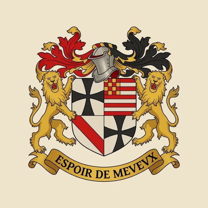
If scales feel too literal, a single column suggests the courthouse; a key suggests counsel kept in confidence. Old heraldic plates are full of these quiet objects, held by supporters or set on a plain shield. Choose one object and let it stand alone.
4 to 8. Shield, Gothic letters, a motto, two colours, a ruled border
A plain shield with one charge suits a family practice. Gothic letters suit a firm with a long name and an old town. A short Latin motto on a scroll suits a firm that likes a little ceremony. Two colours, a deep blue or green with gold, keep printing simple. And a fine ruled border around the whole mark keeps it from floating on the page. Whatever you choose, test it at stamp size first: if the initials blur, simplify.
How to try one for your firm
Illustrative scene made from a real Fable design; not a photograph of a delivered order.
Fable draws a monogram or seal from the firm’s name, its story and the symbol you suggest. The preview is free. Keep the design with the Business pack and you have commercial use in writing, brand files for the web and a stationery collection with letterhead, continuation sheets, business cards, engagement letters, contracts and invoices, with Word versions for the office. A Fable design is a decorative emblem for your firm, not a grant of arms.