Vintage wall art with a face: how to choose an old-master portrait print
Five portraits from three centuries, most shown in rooms, and a simple order for choosing: shape, then palette, then period.
Search for vintage wall art and you will find a great many botanical plates, faded maps and sailing ships. They are pleasant, and they are everywhere. A portrait does something none of them can: it puts a face in the room. A person looking back at you from the wall gives a space character in a way a fern never will.
Old-master portraits can feel intimidating to choose, though. Which period? Which painting? Will it look like a museum in your living room? Here are five portraits from three centuries, most shown in a room, with a simple way to decide.
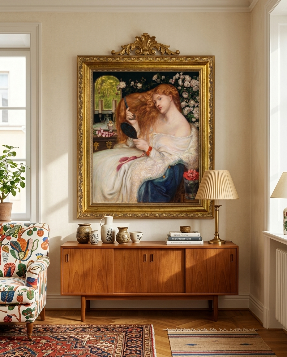
Rossetti's Lady Lilith, 1867: the statement piece
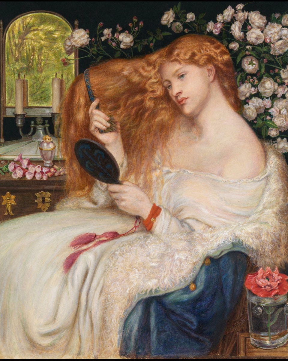
Dante Gabriel Rossetti, a founder of the Pre-Raphaelite Brotherhood, made this version of Lady Lilith in 1867 in watercolour and gouache. It shows a private moment of self-adornment: a woman combing a cascade of red-gold hair, a hand mirror raised, a bower of roses behind her.
The palette — fiery hair, creamy whites, deep greens — is warm and romantic, and the picture is impossible to ignore. Hang it where you want a conversation: above a sofa, or as the one bold piece in a bedroom.
Van Dyck's A Genoese Lady with Her Child, 1625: height and ceremony
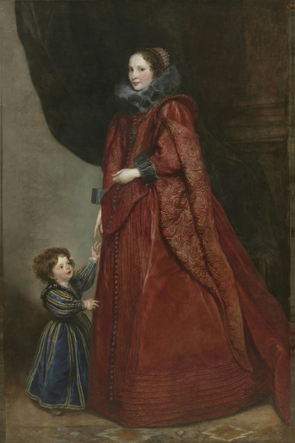
Anthony van Dyck, the Flemish Baroque portraitist, painted this full-length mother and child in 1625. The palette is aristocratic: deep crimson, gold embroidery and a dark, dramatic background, softened by the small child standing at her side.
A full-length figure needs height. Give it a tall wall — a hallway, a stairwell, the space above a narrow console — where its vertical sweep can work. Deep red and gold also sit surprisingly well with light walls and mid-century wood.
See A Genoese Lady with Her Child as a print
Nattier's Portrait of a Woman, 1743: softness for a bedroom
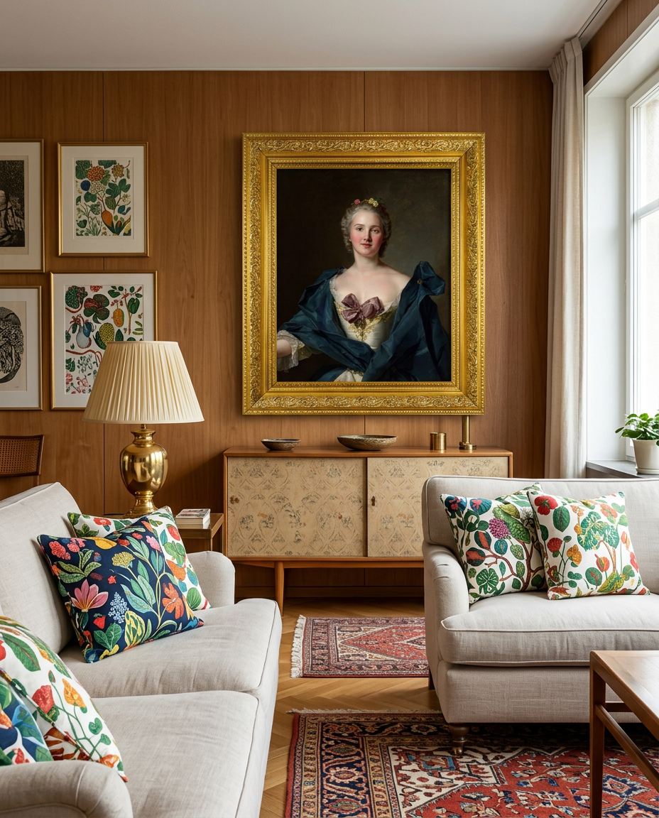
Jean-Marc Nattier was a leading portraitist of the French court under Louis XV. His 1743 portrait is all texture: ivory silk, a dusty-pink bow, small flowers in powdered hair and a deep blue wrap falling from the shoulders.
Half-length portraits like this one are the easiest old masters to live with. The face is the subject, the palette is gentle, and the picture holds its own in a gallery wall — as it does among the botanical prints in the room above.
See Portrait of a Woman as a print
Gilbert Stuart's Elizabeth Beltzhoover Mason: calm for a study
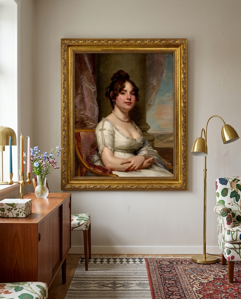
Gilbert Stuart's portrait is direct and serene: a young woman in a crisp white high-waisted dress and a string of pearls, her arms resting, with a curtain, a column and a pale sky behind her. Its restrained palette makes it one of the most adaptable portraits here.
It is a natural fit for a study, a reading corner or a bedroom, and it looks as much at home in a pared-back modern room as in a traditional one.
See Elizabeth Beltzhoover Mason as a print
Renoir's Madame Charpentier and Her Children, 1878: the wide one
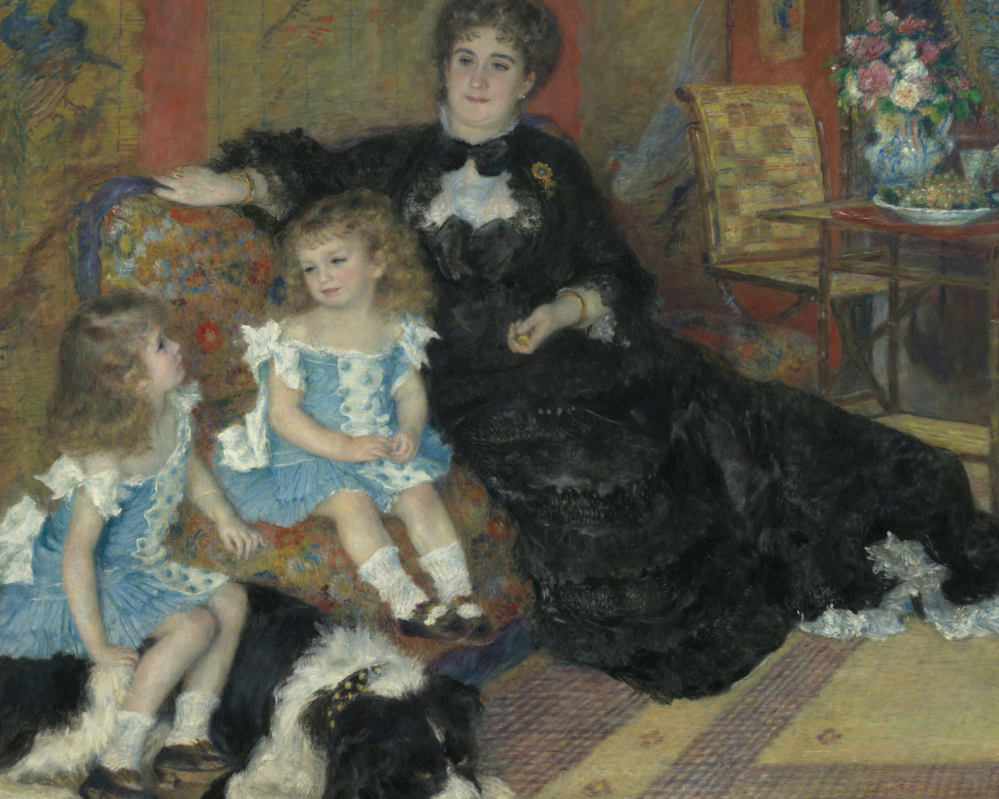
Most portraits are vertical. Auguste Renoir's 1878 family scene is not, which makes it the answer to the most common wall in the house: the long, low space above a sofa or sideboard. Madame Charpentier sits in her Parisian drawing room with her children Georgette and Paul, dressed alike in blue, and the family dog.
Deep blacks and blues against warm interior tones give it weight without gloom. It is a warm, unstuffy choice for the room where a family actually lives.
See Madame Charpentier and Her Children as a print
How to choose: shape first, then palette, then period
1. Shape. Measure the wall before you fall in love with a painting. Tall, narrow walls want full-length verticals like the van Dyck. The space above a sofa wants a horizontal like the Renoir — or a pair of verticals. Half-length portraits like the Nattier and the Stuart are the most flexible. The print size guide has proportions that work.
2. Palette. Match the dominant colours to the room, not the century. Crimson and gold love warm wood; ivory and blue suit pale Scandinavian rooms; Rossetti's red and green wants a little drama around it.
3. Period. Only then choose by era, if it matters to you. A Baroque portrait reads grand and ceremonial, a Rococo one soft and decorative, a Neoclassical one calm and clear, and a nineteenth-century one more intimate and modern.
One portrait as the anchor of a gallery wall
If you already have a gallery wall of prints and drawings, a single portrait is the easiest way to give it a centre. Hang the face slightly above the middle of the arrangement and let lighter pieces gather around it. A gilt frame on the portrait alone is enough to make it the anchor.
About the prints
Each painting above is offered as an archival fine-art print, made to order on heavyweight matte paper with pigment inks. See current prices and print options, or browse the full Masterworks collection by era. And if you'd rather be in the painting than look at it, read how a masterwork portrait is made from your photo.